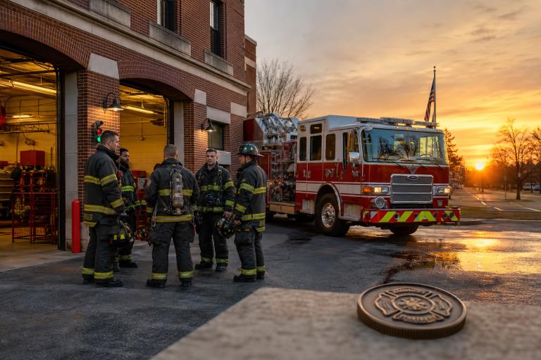
A firefighter challenge coin can recognize a career, celebrate a station milestone, remember a fallen member, or give a graduating academy class a tangible connection to the people beside them. The best custom fire department coins begin with a clear story, then use artwork, wording, and finish choices to tell that story without overwhelming the small space available.
Good design is not simply about putting a helmet, axe, and department logo on a metal surface. It is about deciding what the recipient should feel when they hold the coin years later: pride in service, connection to a crew, appreciation for a mentor, or respect for a meaningful moment.
Why Meaning Matters in Firefighter Coin Design
Challenge coins are commonly used as commemorative items and symbols of affiliation or recognition. The broader challenge coin tradition helps explain why these small objects can carry such personal weight. For a fire-rescue organization, a coin may represent long shifts, trusted partnerships, hard-earned training, and a commitment to the community.
Meaningful details usually matter more than decoration alone. A station number, an apparatus silhouette, a local landmark, a company nickname, or a service date can turn a polished design into a specific record of who the coin represents. Before selecting colors or finishes, decide what the coin needs to preserve.
Start With the Purpose
A strong coin starts with one direct question: why is it being made? The answer should guide the tone, imagery, wording, and level of formality from the beginning.
- Academy graduation: Focus on the class year, academy identity, training imagery, and a short statement of accomplishment.
- Promotion or retirement: Highlight rank, years of service, a unit assignment, or a message of appreciation.
- Station anniversary: Include the station number, opening year, neighborhood connection, or historic apparatus reference.
- Memorial service: Use restrained imagery, verified dates, and respectful wording that keeps the honoree at the center.
- Training achievement: Recognize a specialty such as rescue, EMS, hazardous materials, or fire investigation.
- Mutual-aid recognition: Emphasize shared response, regional cooperation, or the agencies involved.
- Community fundraiser: Pair department identity with the cause being supported.
When the purpose is specific, design choices become easier. A memorial coin should not use the same playful tone as a station open-house coin, and a retirement coin deserves more personal detail than a general giveaway.
Choose Symbols That Tell a Clear Story
Fire-service imagery is powerful because recipients can often understand it at a glance. The key is to choose symbols that add meaning rather than filling every open area.
Useful Design Elements
- Department patches, seals, or station emblems
- Fire apparatus, helmets, ladders, axes, hoses, or hydrants
- Memorial bells, service dates, or a carefully selected line of tribute
- Local landmarks, community symbols, or geographic features
- Training towers, rescue tools, or EMS symbols for combination departments
- A company mascot, motto, or unit designation when it is meaningful to the group
Choose one main symbol first, then add only a few supporting elements. For example, a station anniversary coin may place the station crest or building at the center, with the apparatus number and anniversary years arranged around it. That approach is clearer than combining every available fire-service icon on one side.
Balance Text, Images, and Detail
A coin has limited room, so every line and letter must earn its place. Short wording is easier to read, especially around a curved outer edge. Large, high-contrast lettering generally remains more legible than narrow text surrounded by intricate artwork.
- Keep the main message brief and place the most important words where they can be read quickly.
- Use larger letters for names, dates, station numbers, and rank when those details are central to the design.
- Avoid extremely fine lines that may lose definition when the artwork is reduced to coin size.
- Give detailed illustrations enough open space to remain recognizable.
- Verify every name, date, number, spelling, and abbreviation before approving artwork.
A long motto can often be simplified without losing its purpose. Instead of using “Dedicated to Protecting the Lives and Property of Our Community,” a coin might use “Service, Courage, Commitment.” The shorter phrase is more readable while still reflecting the department’s values.
Plan the Front and Back Together
The two sides should function as connected parts of a single story. Repeating the same logo, date, and wording on both sides wastes valuable space that could be used for a more complete design.
- Front: Use the primary emblem, a central visual, or the department identity.
- Back: Add the event details, years of service, station number, recipient message, or supporting imagery.
- Edge: Consider a short phrase, sequential numbering, or a limited commemorative detail if the production options allow it.
For instance, a retirement coin could feature the department emblem on the front and the retiree’s name, rank, years of service, and assigned companies on the back. The result feels intentional because each side has a distinct job.
Match the Design to the Recipient
The intended recipient should shape the final design. A recruit coin can highlight the academy class and training experience. A leadership coin may be awarded for command responsibility or a major initiative. A station coin may celebrate local history, a house number, and the people who serve that neighborhood.
Retirement and memorial coins deserve special care. Confirm dates and ranks with official department records or the family when appropriate. Keep the wording personal but concise, and choose imagery that reflects the individual’s service rather than relying on a generic template.
Avoid Common Design Mistakes
- Adding too many symbols, slogans, and colors to one side.
- Using text that becomes too small to read comfortably.
- Choosing colors with weak contrast against the metal finish.
- Using generic artwork without a local, personal, or event-specific detail.
- Mixing solemn and humorous elements without a clear reason.
- Failing to confirm names, ranks, dates, and station numbers.
- Ignoring how raised metal, recessed areas, and finish choices affect readability.
A dependable rule is simple: remove any element that does not support the coin’s purpose. A less crowded design is often easier to understand and more likely to remain meaningful over time.
Use a Simple Planning Checklist
- Define the reason for the coin.
- Identify who will receive it and what they should remember.
- Choose one central symbol or visual idea.
- Select a few supporting details with personal or local significance.
- Write all wording in a shared document before placing it into the artwork.
- Choose a shape and size that suits the amount of detail required.
- Review color contrast, lettering size, and visual hierarchy.
- Check every name, date, rank, number, and abbreviation.
- Ask several intended recipients or department stakeholders for feedback.
- Approve the final proof only after a slow, line-by-line review.
Final Thoughts
The strongest firefighter challenge coins do more than display a logo. They preserve a story, recognize people, and connect a department’s current work with its shared history. Clear purpose, carefully selected symbols, readable wording, and thorough proofing will help create a coin that recipients are proud to carry and keep.